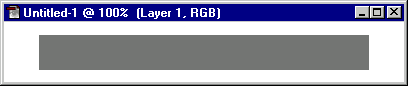
This is quite easy. First, make a new document with a width of 400 pixels and a height of 60 pixels.
Create a new layer with the ![]() icon in the Layers palette. Select the rectangular selection tool and drag out a selection in the centre of the image, 330 x 35 pixels in size. (To make this process easier, select Options in the Navigator, Info, Options palette, select the Options tab, for Style: select Fixed Size and enter 330 for Width and 35 for Height. Then drag in the image window. Don't forget to switch the Style back to Normal afterwards!)
icon in the Layers palette. Select the rectangular selection tool and drag out a selection in the centre of the image, 330 x 35 pixels in size. (To make this process easier, select Options in the Navigator, Info, Options palette, select the Options tab, for Style: select Fixed Size and enter 330 for Width and 35 for Height. Then drag in the image window. Don't forget to switch the Style back to Normal afterwards!)
Using the Fill command from the Edit menu, fill this rectangle with 50% gray.
Now for the rounded ends. Create a new layer. Select the Elliptical Marquee selection tool and position the pointer right in the centre of the left-hand edge of the rectangle. Holding down Shift+Alt (Windows) or Shift+Option (Mac), drag out a circle until the top and bottom edges of the circle lie exactly on the top and bottom edges of the rectangle (it may help if you zoom in a bit first). Fill this circle with 50% gray also.

Now drag this layer ("Layer 2") down to the New Layer icon in the palette to duplicate it. Hold down the Control key and, in the image window, drag this duplicate circle to the right of the rectangle, until it half-protrudes from the right-hand edge. Again, zoom in to position the circle exactly. Now hit Control+E three times (or select Layer > Merge Down three times), so that you end up with one layer ("Layer 1") containing our rounded menu bar:

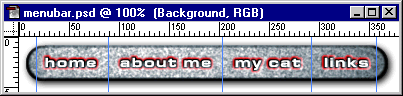
Double-click on the layer in the Layers palette and rename it "Menu Bar". Hit OK.
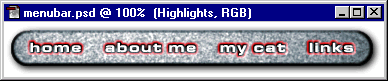
Now's a good time to save your image! Call it something like menubar.psd.
Making the text options
Now to make the text buttons along the bar. Select the Text tool (the big T!) and choose your favourite font. Type in the menu options you would like, with each option separated by 4 or 5 spaces. Click OK to place the text on your image, then move the layer about until the text is centred nicely on the bar:
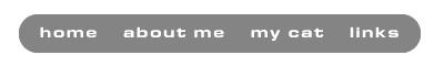
Rename this new layer "Menu Text", by right-clicking on the layer in the Layers Palette and choosing Layer Options....
Getting that sandstone effect
Let's make our menu bar nice and bumpy, like it was made from sandstone. Select the Menu Bar layer and Control+click on the layer in the Layers palette to select all the opaque pixels (this will stop the effect "leaking out" the edges of the bar). Select Filter > Noise > Add Noise... and enter an Amount of 35. Make sure Gaussian and Monochromatic are selected (we want sandstone, not confetti!). Click OK.
Now to smooth the texture out a bit. Select Filter > Blur > Gaussian Blur... and enter a Radius of 0.5 pixels. Keep the selection around the bar.
Making it 3-D
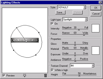
Now comes the fun part. We're going to use the wonderful Lighting Effects filter to turn our 2-D bar into a 3-D one!
We want two things to be bevelled - the bar itself, and the areas around the text links, so that the text looks "indented" into the bar. We use the selection tool to tell the Lighting Effects filter which bits to bevel. We've already selected the bar (if you've kept the selection as mentioned above!), but now we want to subtract the areas around the text from the selection.
Becuase our text is all on one layer, this is really easy. Hold down Control+Alt (Win) or Control+Option (Mac) and click on the Menu Text layer in the Layers palette. Hey presto! Our new selection has had the opaque areas of the text layer cut out of it.
Now to make the bevel nice and smooth, go to Select > Feather... and enter a Feather Radius of 1 pixel. Now save this selection as a new channel, so that we can use it in Lighting Effects. Choose Select > Save Selection... and make sure New Channel is highlighted. Click OK. You can now hit Control+D to deselect.
Go to Filter > Render > Lighting Effects. With the DEFAULT style selected, select your new channel from the bottom of the Texture Channel drop-down list (it will probably be called "#4"). Experiment with different light positions and settings until you get a nice 3-D bevelled effect - these settings worked well for me:
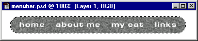
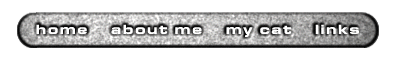
Hit OK and take a look. If you're not happy with the results, hit Control+Z (Undo) and go back and have another go. In the end you should end up with something like this:
Making it even more 3-D
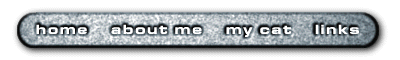
We can enhance our 3-D effect further with a drop shadow. Drag the Menu Bar layer to the New Layer icon to duplicate it, double click on the layer in the palette, and name it "Drop Shadow". Hit OK then select Edit > Fill, pick Black from the Use drop-down box and make sure Preserve Transparency is checked. Click OK.
Drag the Drop Shadow layer below the Menu Bar layer in the palette. Hold Control and press the Right arrow and Down arrow> keys twice each to shift the shadow down and to the right a bit. Select Filter > Blur > Gaussian Blur... and enter 3.5 for the Radius. Hit OK.
Kind of blue (great album!)
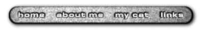
Say I'm listening to Miles Davis while I'm making this bar, and I'd like to give it a touch of the blues to make it more refined and interesting. Make sure the Menu Bar layer is highlighted in the palette, then choose Image > Adjust > Hue/Saturation.... Select Colorize and enter values of -160 for Hue and 10 for Saturation. Hit OK.
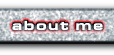
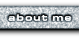
Making the highlights
We want our options to highlight in red as the mouse is moved over them, so let's make a new layer containing the highlights. First Control+click on the Menu Text layer in the palette to select its pixels, then click on the New Layer icon to create a new layer on top. Choose Select -> Modify -> Expand... and enter a value of 2 pixels. Now pick a nice bright red (e.g. 255,0,0 or the first swatch in the default Swatches palette) and select Edit > Stroke. Enter a Width of 2 pixels, select Center for Location, set Opacity to 100% and Mode to Normal, and turn Preserve Transparency off. This will make a solid red border around the text on our new layer.

Rename this layer "Highlights".
This effect is a bit harsh, so let's soften it and make it more realistic by changing the blending mode. With the Highlights layer still selected in the palette, pick Screen from the blending mode drop-down box (the one which currently says Normal). To mellow the effect a bit more, choose 80% on the Opacity slider to the right of the blending mode box.
Saving space
Our menu has some unnecessary white space around it, so let's crop the image a bit. Using the rectangular selection tool, drag out a rectangle that covers all of our image, including the drop shadow (if in doubt, allow extra space around the drop shadow, as it can be difficult to see where the shadow stops). A selection of 380 x 55 pixels should do the trick. Then select Image > Crop:
Cutting it up
Now for the clever part. We need to make 10 separate images from our main image - 4 for each of the text options unhighlighted, another 4 for the highlighted (rollover) versions, and two for the round end stubs of the menu bar. Luckily, Photoshop has the Guides feature, which makes this process a lot easier.
Turn on the Rulers using Control+R or select View > Show Rulers. Click in the ruler along the left-hand edge and, with the mouse button held down, drag to the right. That vertical blue line is a guide, and it will help us with selecting the bits of our image to chop up. Drag it so that it is mid-way between "home" and "about me" and release the button. If you got it a bit wrong, hold down the Control key and drag the guide around until you get it right.
(You may find as you drag that the guides "snap" to the edges of the pixels on the current layer. This is handy for aligning guides right on the edge, but it can be a bit of a pain in this case. To avoid this happening, select the Background layer in the Layers palette, as there's nothing on that layer for Photoshop to snap to.)
Repeat this process for the other two gaps between the menu options, then place two extra guides, one to the left of "home" and one to the right of "links". Remember - to create a new vertical guide, simply click in the left-hand ruler and drag to the right. You should end up with something like this:
Now that we've marked out where to chop up our image, the rest is easy. Choose the rectangular selection tool. Make sure Snap To Guides is highlighted in the View menu. To make this task easier, drag out the image window so that there's some grey around the image, or else zoom in a bit. Working from left to right, cut out each of the sections between the blue guide lines as follows:
- Drag out a rectangle that extends from the top left corner of the section to the bottom right. Make sure all of the section is selected. The Snap To Guides option makes this easier by snapping the left and right edges of your selection to the guides.
- Press Shift+Control+C (Copy Merged) to copy all of the layers under the selection as one layer. Press Control+N and hit OK to accept the default settings. Press Control+V to paste our merged selection into this new image:
- Now choose File > Export > GIF89a Export and save the image. Call them whatever you like, but we recommend:
left.gif,home_on.gif,about_on.gif,cat_on.gif,links_on.gifandright.gif.
That's six of our 10 images done. The other four will be the non-highlighted, or "off" versions of our menu options. Turn off the eye icon next to the Highlights layer in the Layers palette, and repeat the above process for the four menu option images. Call them home_off.gif, about_off.gif, cat_off.gif and links_off.gif.
Your images should look like these: (If you screwed any of them up, you can always cheat and grab them from here!)
 |  |  |  | ||
 |  |  |  |
Shake it, baby!
Now we want to make that menu move. It will help you a lot if you read our JavaScript tutorial on rollover buttons first, as this menu uses the same principle.
First, place the images in a row in your web page. Provided you use style="border: none;" the images should sit snugly up against one another, forming a seamless menu bar. Give each image a name with the name attribute, and place tags around each image, including the onmouseover and onmouseout JavaScript event handlers.
Of course, you don't need the stuff for the two end pieces!
Here's the code for the "home" button to get you going. Have a look at the source of this page if you want to see the rest.
onmouseout="button_off('home');"
onmouseover="button_on('home');">
style="border: none;" width="72" height="55" name="home"/ />
Next, we need to create our JavaScript image objects at the start of the Web page, and point each object to the GIF files for the image (both the on and off versions). It's a good idea to include the image width and height in pixels when creating image objects - you can find this out by dragging your GIFs one by one into Photoshop, then Alt+clicking (PC) or Option+clicking (Mac) on the status bar where it says "Doc:".
Again, here's the example for the "home" button:
home_on = new Image ( 72, 55 );
home_off = new Image ( 72, 55 );
home_on.src = "images/menubar/home_on.gif";
home_off.src = "images/menubar/home_off.gif";
Finally, we make our two JavaScript functions, button_on() and button_off(), add the sniffer code and the tags around the JavaScript, and we're cookin'! Take a look at the source code for this page, which should be fairly self-explanatory.
You should now be able to take these techniques and create wonderful menu bars for your own websites! If this tutorial has helped you make a groovy menu, please tell us - we'd love to see it!
No comments:
Post a Comment